EdTech Website Redesign UX Case Study

Client: UpliftK12

This was a UX design project where I worked alongside a team to redesign a website for an EdTech company offering online teaching tools and services for math teachers.
View Prototype

What is UpliftK12?

UpliftK12 is an online platform designed for math educators teaching K-12 students. It offers a range of manipulatives (both physical and visual tools) to help students understand math concepts. The platform aims to improve online math education.

Critical Issues

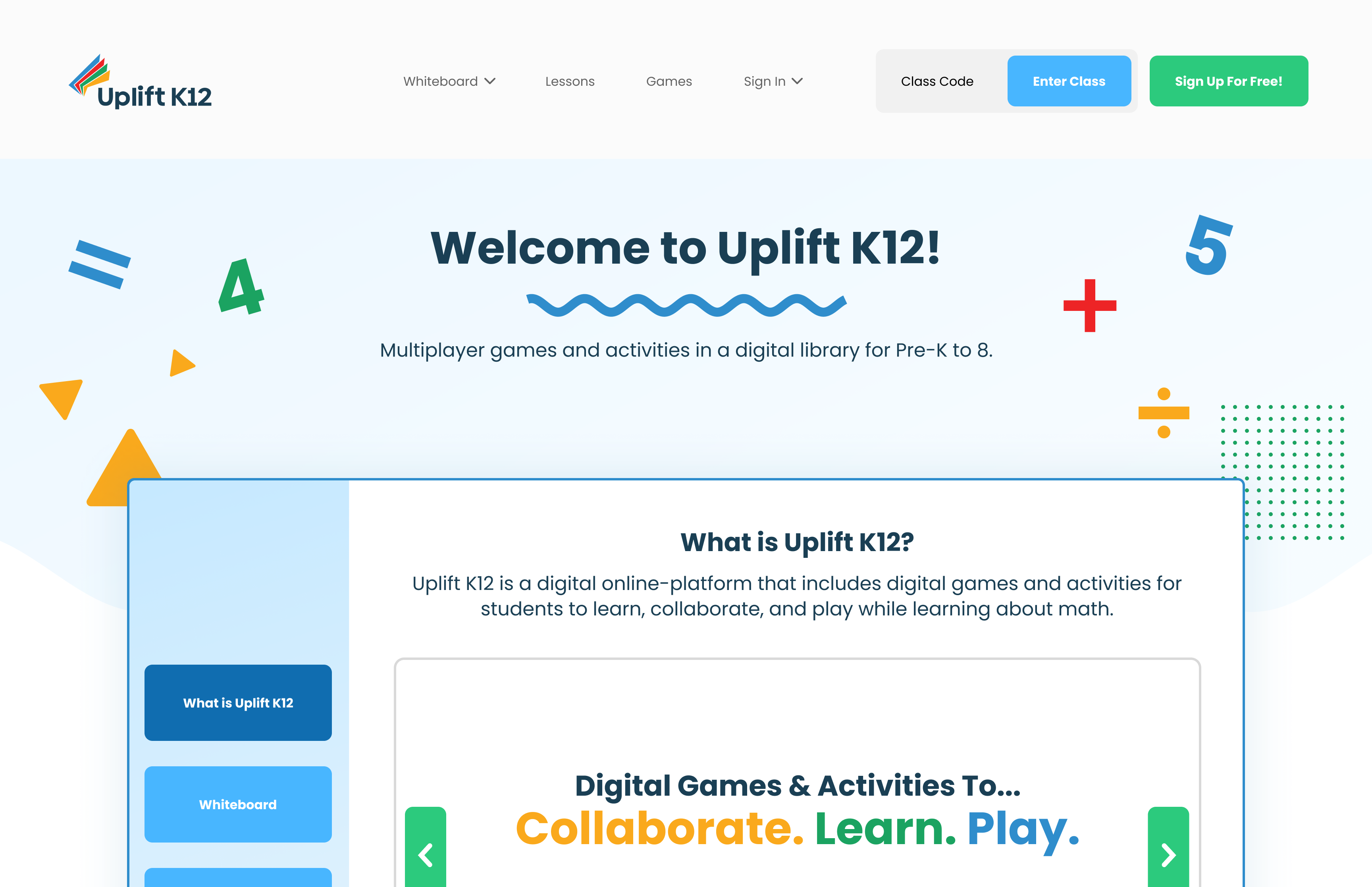
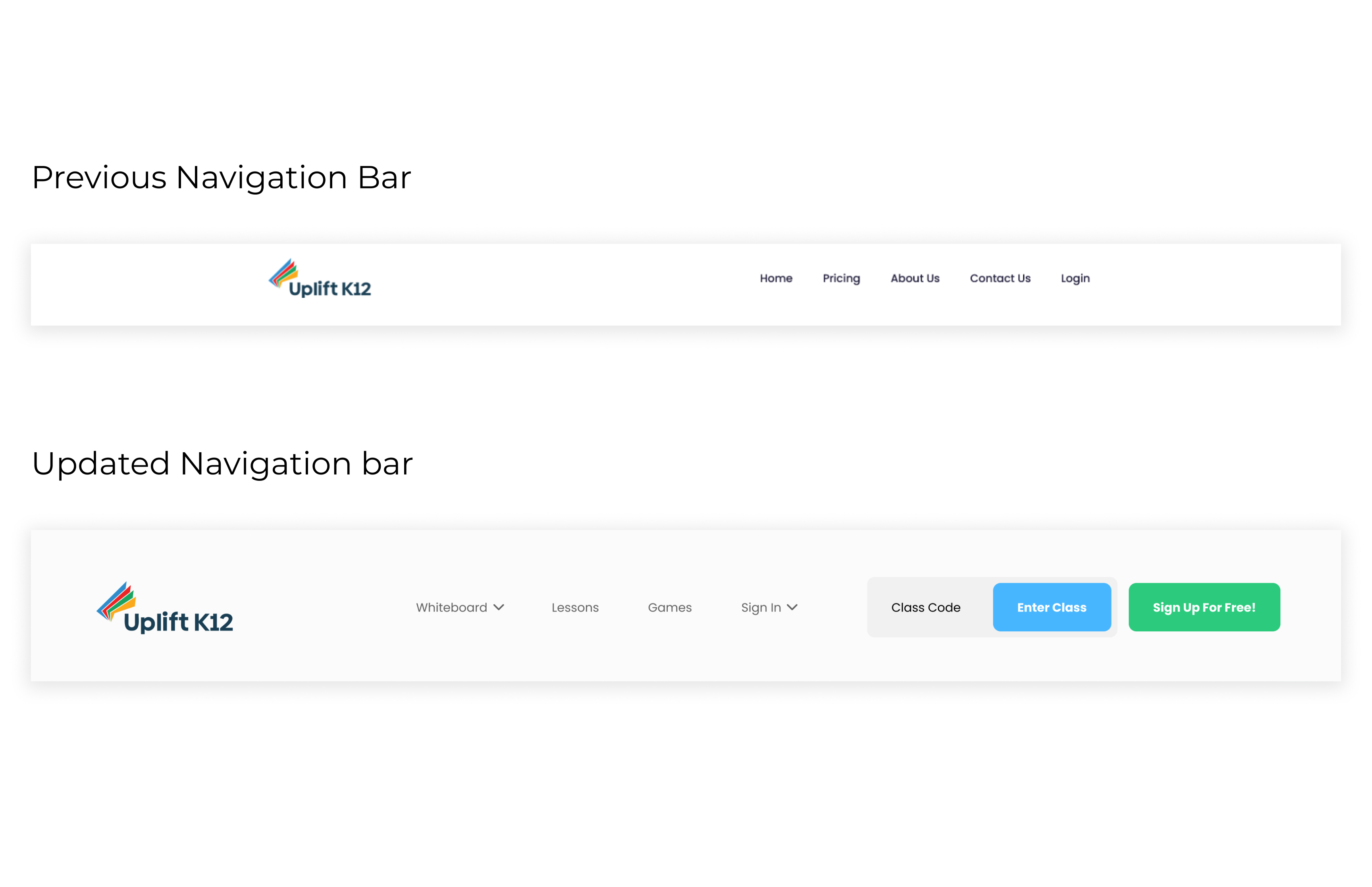
In its beta stage, UpliftK12's homepage failed to clearly explain the platform's features and services. This lack of clarity made it difficult for visitors to understand the value of the platform and decide whether to sign up. Founder Mehul Shah tasked us with redesigning the website to address the following concerns:
  • The home page needed a better explanation of what features, activities, and services were offered through the platform.
  •  The home page itself did not guide the site visitor through what services it offered, inhibiting their ability to determine whether they would like to sign up for the service.

Research

Interviews with Educators

We interviewed math educators (references provided by Mehul) to understand their needs and challenges when using online tools. Our key insights included:

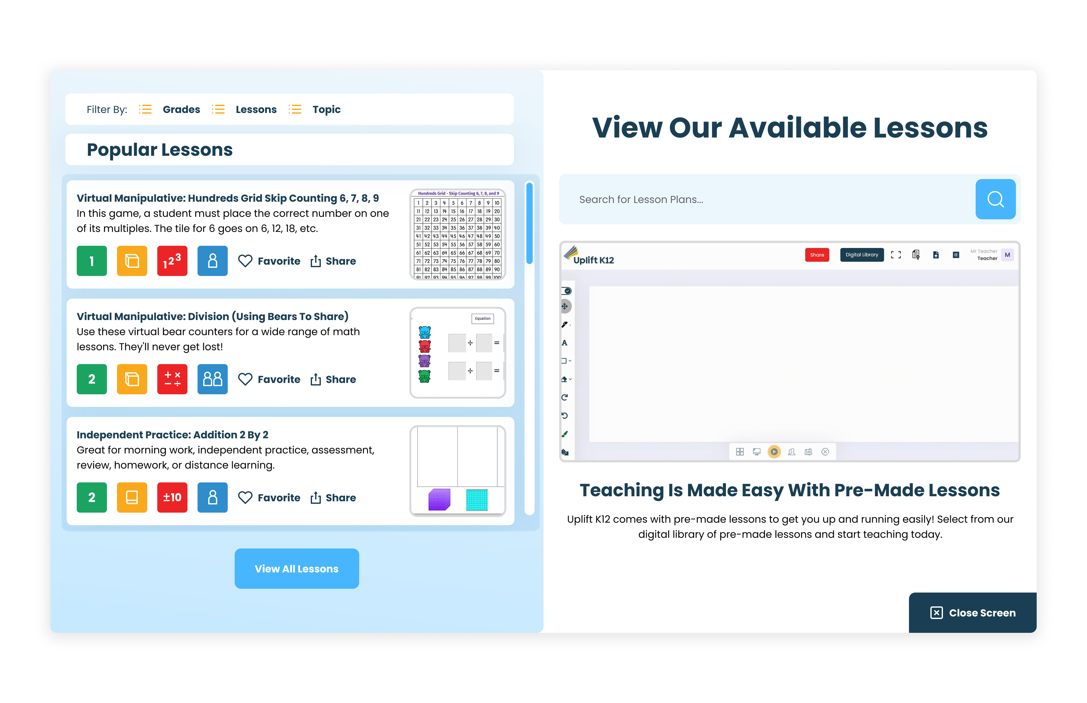
Lesson plans need to be engaging

Teachers wanted engaging, interactive games and activities that they could use in their online lesson plans.

Teachers are limited on time

The platform needed to be user-friendly, allowing intuitive navigation for teachers to quickly utilize it without any hassle.

Flexibility in tools is key

A variety of tools was important to support different teaching and learning styles.

Design Solutions

Overhaul of navigation bar

We revamped the navigation bar with new links like Whiteboard, Lessons, Games, and added a clear call-to-action "Sign up for Free!" button.

Adding in a showcasing of features

To address time constraints for teachers, we added a demonstration modal to the hero section. This allowed visitors to flip through slides showcasing the platform’s background, features, lessons, and games.

Introduction of "Lesson Plans" and "Games" modals

We introduced a lesson plan browsing modal with filters for Grade, Lesson Type, and Topic. Teachers could now search by keyword, save their favorite lessons, as well as share lessons.

Inclusion of further options to learn in-depth about the platform

Finally, to round things out I added in a checkout process for online shoppers to fully purchase products off of the website to eliminate redirection to the business’s Amazon storefront.

Conclusion & Reflection

Overall, we successfully addressed UpliftK12’s issues by making the platform more accessible and informative for teachers, likely contributing to increased sign-ups. The client was impressed, and upon revisiting the site, I noticed many elements of our redesign had been retained, showing the lasting impact of our work.

If I could revisit the project, I’d focus on further user testing and competitive analysis to continue improving the platform’s effectiveness.