
A self-directed brand identity for a fictional minor league hockey franchise — built as a complete system from mascot to merchandise, rooted in the regional identity of Gainesville, Georgia.
Brand & design systems lead
Identity, templates, social assets
Brand & design systems lead
This was a personal project with no client and no brief except the one I wrote myself. I wanted to approach sport branding the way it actually gets done at the professional level: starting with place and community before touching a single color or typeface. The fictional premise was the Gainesville Bluegills, a new Southern Hockey League franchise launching in 2025 — and the constraint I set myself was that every design decision had to be justifiable if this were real.
Minor league hockey in the South is a genuinely interesting brand problem. You're selling a cold-weather sport to a warm-weather culture, which means you can't borrow the visual language that works for a franchise in Minnesota or Boston. The identity has to earn local loyalty on different terms — through place, not archetype.
Gainesville, Georgia sits on Lake Lanier, and the bluegill — a sunfish native to those waters — became the anchor of the concept. It's not a predator, not a generic power animal. It's specific, regional, and a little unexpected for a hockey team, which is exactly the point. A new franchise trying to build roots in a community doesn't need to look intimidating. It needs to look like it belongs.
That geographic grounding shaped the entire palette. Dark Blue anchors the system with the depth and authority you expect from a hockey brand. Lanier Green references the lake directly — the color of the water, the natural environment that defines the region. Electric Yellow adds energy and visibility, particularly useful at the scale of arena signage and merchandise. Lake Blue and Blue Silver round out the system as supporting tones, giving the brand flexibility without introducing colors that break the geographic logic.
Every color has a name that earns its place. That's not decoration — it's a communication tool for anyone using the brand guide.
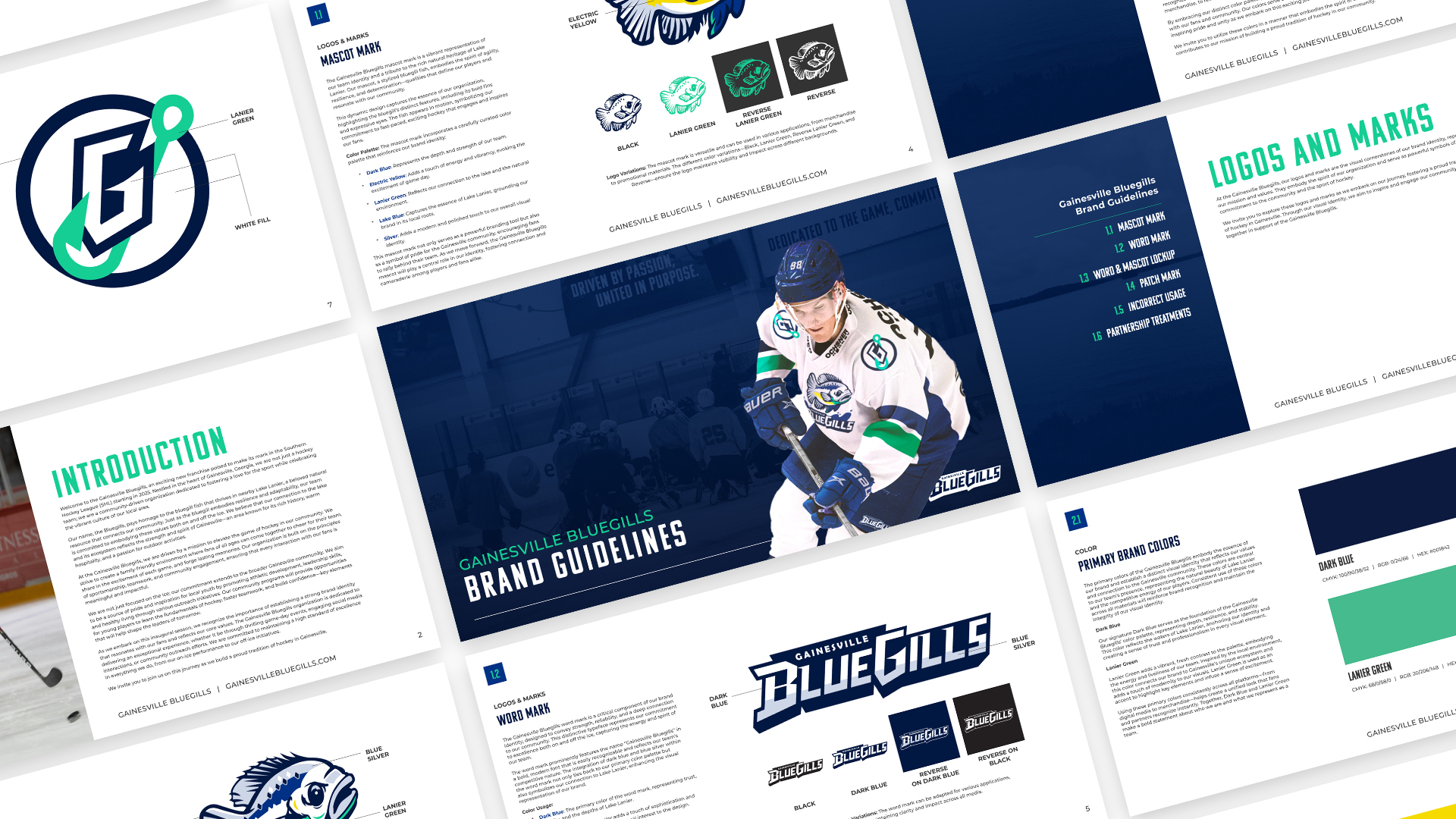
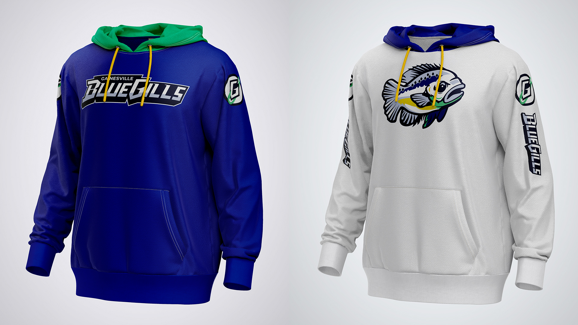
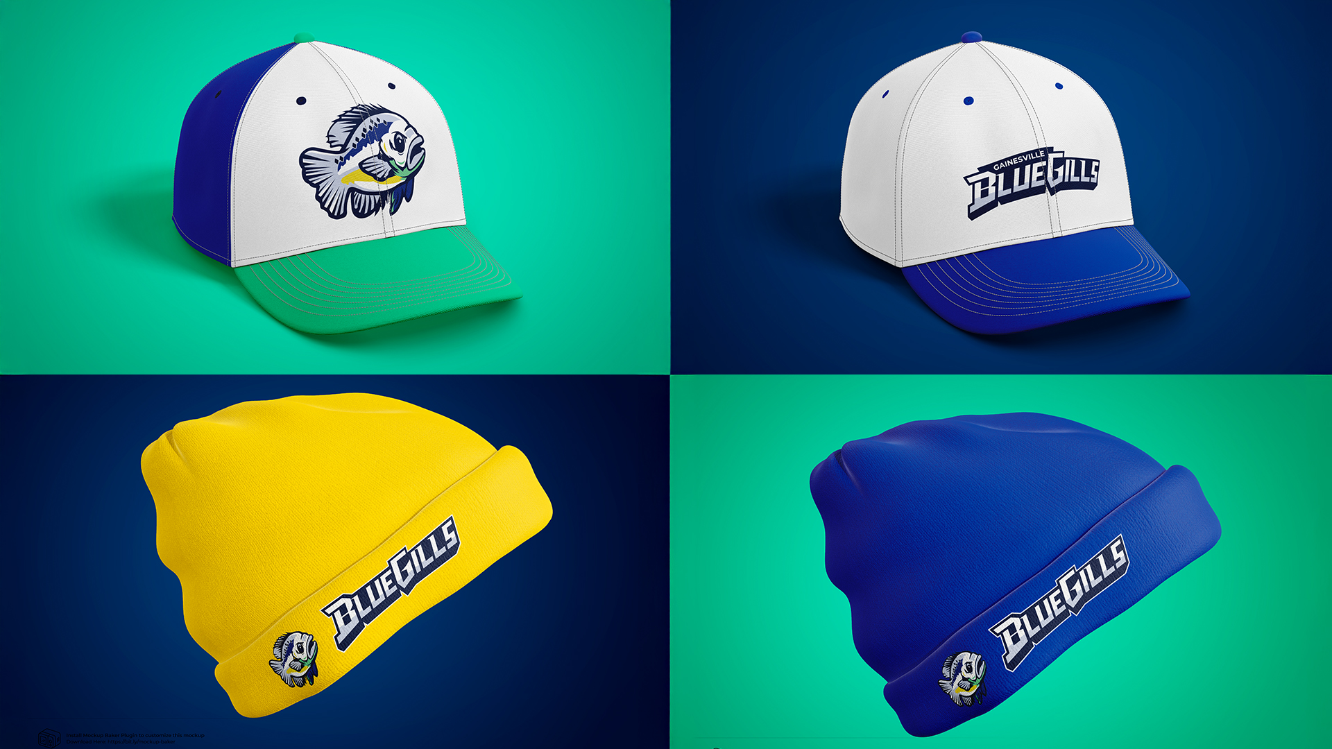
The identity has three distinct marks. The wordmark uses a custom display treatment built on a bold, forward-leaning structure — athletic without being generic — with Komu A as the typographic foundation for its compressed proportions and high legibility at small sizes. The mascot mark is a detailed illustration of a bluegill fish, characterful enough to carry a jersey chest or a hoodie front on its own. The G monogram integrates a fishing hook into the letterform — a detail that reads as a clean geometric mark at distance but rewards a closer look.
The brand guidelines cover all three marks, color variations, correct and incorrect usage, and partnership logo treatments — built as if it needed to be handed off to a real marketing department on day one.


Komu A handles headlines and display applications. Cheddar Gothic Sans Italic provides accent typography — specifically chosen for its forward momentum, used in pull quotes and campaign copy like the team slogan. Montserrat handles all body text. The system gives the brand three distinct voices — authoritative, energetic, and readable — without ever feeling inconsistent.
The slogan, "Dedicated to our game, committed to our community," informed by the typography pairing, was designed to work at billboard scale with the italic accent treatment on "our game" and "our community" — using Lanier Green to activate the Cheddar Gothic weight against the dark blue field.

The true test of any brand identity is whether it holds up under real production conditions — not just on a brand guide slide. I stress-tested the system across outdoor advertising, arena scoreboards, two hoodie colorways, caps, and beanies. The Electric Yellow beanie in particular was a deliberate push — it's the hardest color to misuse, and if the wordmark can hold its own on that field, the system is solid.

Self-directed work has a failure mode: without a client pushing back, you can let yourself off the hook too easily. The discipline here was treating every fictional decision as a real one — asking "would this hold up in market?" rather than "does this look good in a mockup?" Those are different questions. The gap between them is where most personal portfolio projects fall apart, and where I tried hardest to stay honest.
